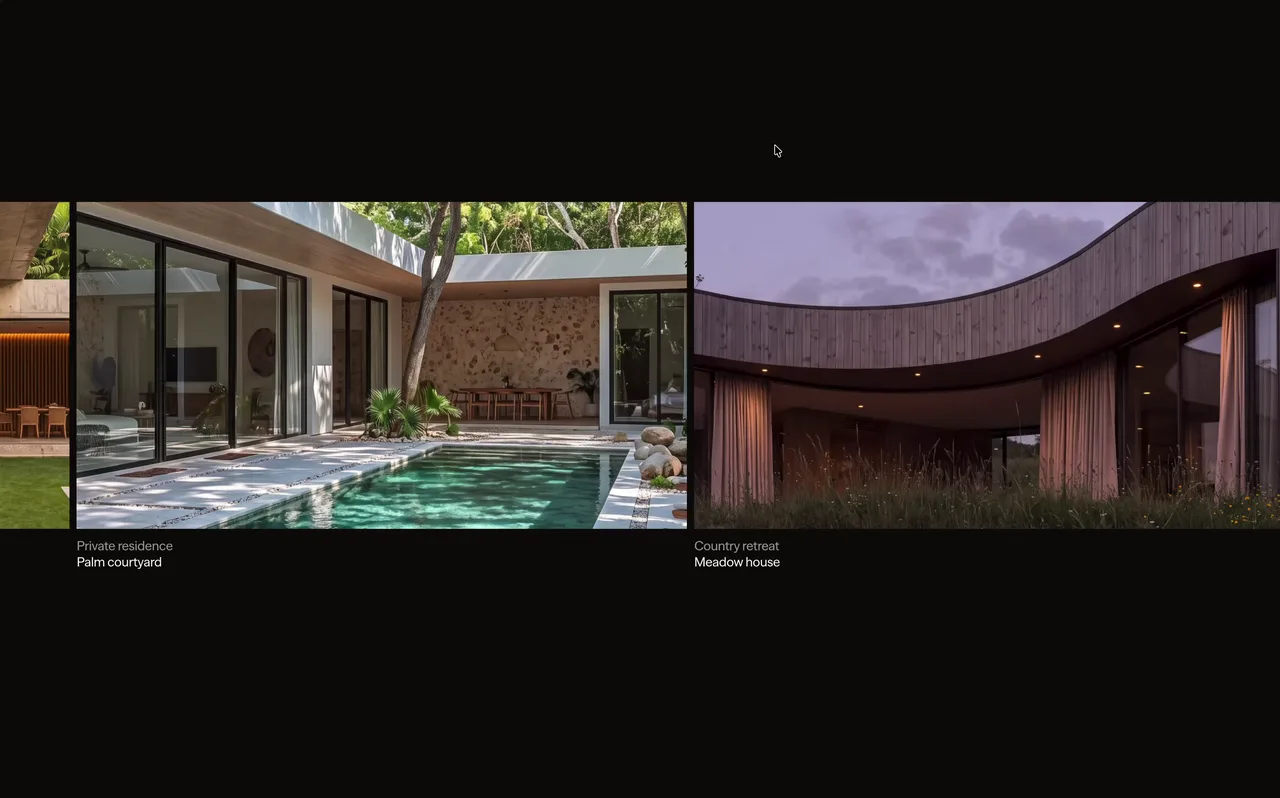
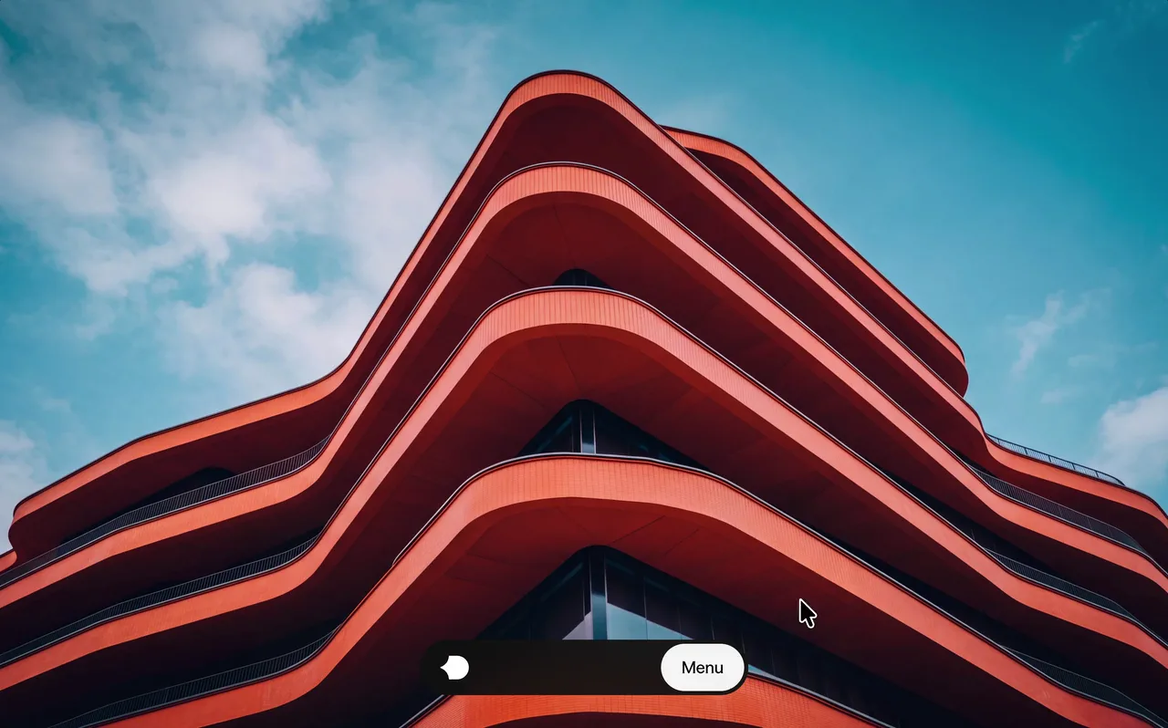
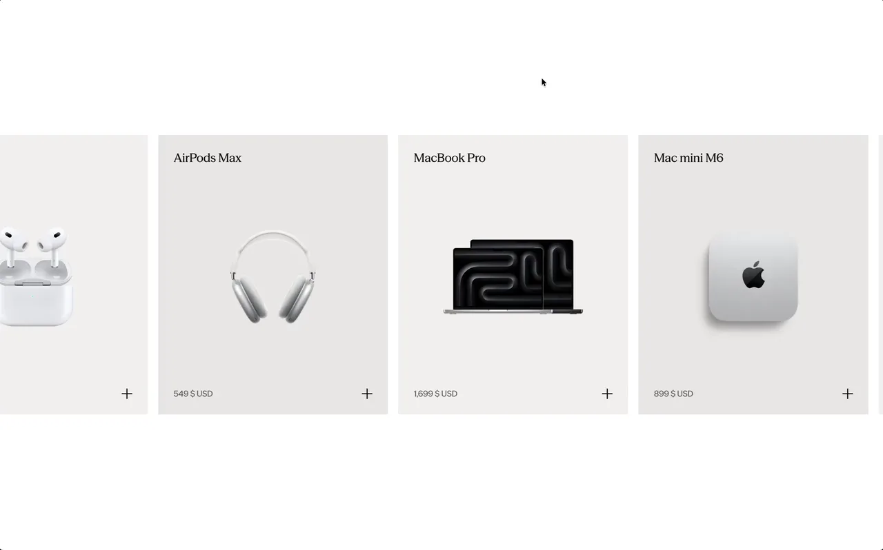
This is Inspo
The best websites, handpicked weekly. Only the exceptional ones make it in.


Everything you need to find better ideas and build websites that stand out.
Go find the details that make your next project stand out. We'll keep adding new ones every week.
Unlock unlimited inspiration for your next project.
The best websites, handpicked weekly. Only the exceptional ones make it in.
Type what you need in your own words. Smart Search will find the best matches for you, or use filters to narrow things down.
Real transitions, buttons, and sections as paste-ready code. The details that make sites unforgettable.
Connect Details to your AI. Find the right inspiration, explore directions, and bring them into your project.
Discover 109+ examples from real websites.
Media Showcase, Scroll Animations, Section Transition
Couldn't load more items. Refresh the page or sign in again.


One great detail is all it takes to change a project. Find yours. New ones added every week.
The goal isn't to copy what you see. It's to train your eye, find better ideas faster, and make stronger design decisions when you start your next project.
How one section hands over to the next is what separates a flowing page from a stack of blocks. These examples capture color flips, curtain reveals, overlapping layers and sticky handovers from live sites.
Continuity is the key: a color, element or scroll rhythm persists across the seam. Strong transitions still read clearly at both full speed and half speed.
The more exceptional interfaces you study, the easier it becomes to recognize the spacing, hierarchy, motion and interaction choices that make a website feel considered.
Over time, those decisions become instinct, so you can move from a blank page to a strong direction faster.
Full-site galleries are useful when you need broad direction. But finding one strong navigation, footer or transition means opening and scanning site after site.
Details organizes the exact parts, so you can compare relevant approaches in minutes instead of searching for hours.
Yes, as references, not templates. Study what makes an idea work, combine it with other references, and adapt it to the project's own content and brand.
Great work is not copied from one source. It is assembled from many good decisions.
Probably. One useful layout or interaction can save hours of searching and help turn an average project into one that feels considered.
Pro gives you the full library and everything added each week.
Add to board
This will delete and all the items saved in it. Items saved to other boards are not affected.
Manage the identity connected to your Details account.
Permanently remove your Details account and its associated data.
Review your personal plan and any Team access attached to your account.
Browse the latest Details releases with Starter access.
Manage shared access, seats, and the people you work with.
Invite teammates to save inspiration together, share boards, and add comments in one workspace.
Handpicked from the most original, high-end design on the web. Now available directly to your AI.
See how it worksTell your AI what you’re working on and get relevant references directly from Details.
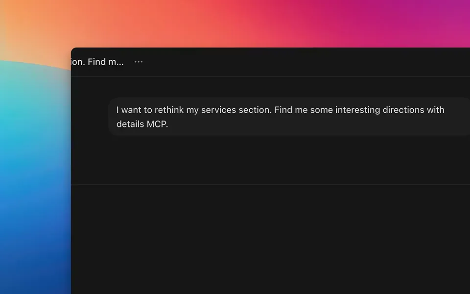
Explore the references together. Mix a layout from one, motion from another, or simply choose the direction that feels right.
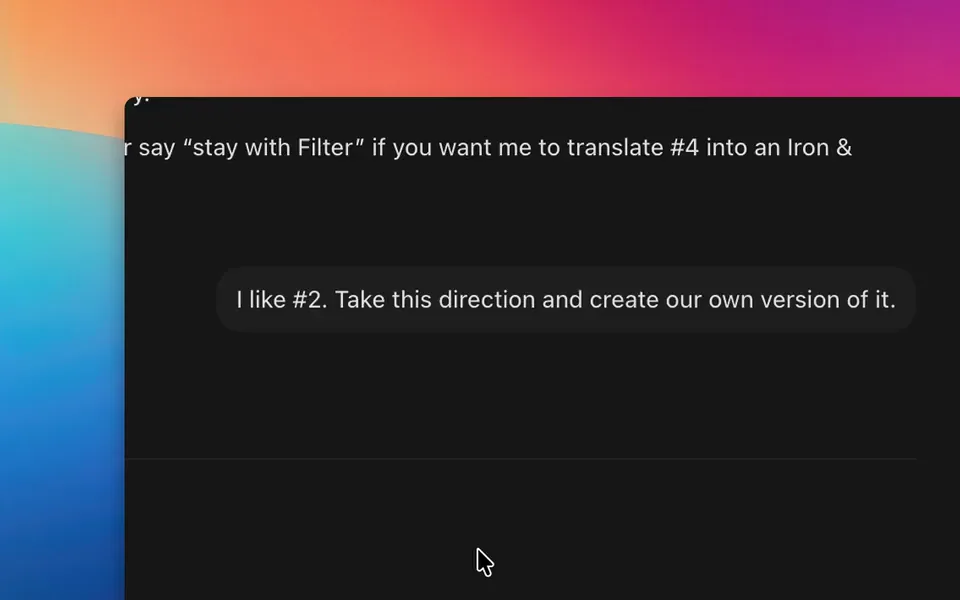
Your AI understands how each reference works and can adapt those ideas to your own project.
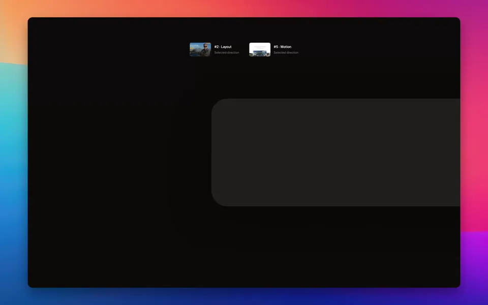
Choose your client and we'll show you exactly how to connect it.
Run this once in a terminal to register Details for your user account.
claude mcp add details --scope user --transport http https://api.details.so/mcp Start Claude Code, enter the command below, then choose Details.
/mcp Choose Authenticate and sign in to your Details account in the browser.
Return to Claude Code and start searching Details.
In Cursor, open Settings → Tools & MCP and choose New MCP Server. Use global settings for every project, or project settings for one workspace.
Paste this configuration into your mcp.json file and save it.
{
  "mcpServers": {
    "details": {
      "url": "https://api.details.so/mcp"
    }
  }
} Back in Tools & MCP, find Details, choose Connect, and approve access in the browser.
Details is now available to Cursor in the scope you selected.
Run this once in a terminal to register the remote server.
codex mcp add details --url https://api.details.so/mcp Run the login command to open Details authorization in your browser.
codex mcp login details Sign in to Details, review the request, and choose Continue.
Return to Codex. Start a new session if it was already open during setup.
From the chat input, open the add menu, choose MCPs, then select Add MCP.
Name the connection Details and paste the remote server URL.
https://api.details.so/mcp Select OAuth when prompted, then sign in and approve Details access.
Details is now available from your v0 chat.
Open the integrations or MCP area in your AI client.
Create a remote HTTP MCP server named Details and paste this address.
https://api.details.so/mcp Use OAuth when available, then sign in and approve access to Details.
The Details tools should now appear in your client.
Handpicked from the most original, high-end design on the web. Now available directly to your AI.
See how it worksTell your AI what you’re working on and get relevant references directly from Details.
Explore the references together. Mix a layout from one, motion from another, or simply choose the direction that feels right.
Your AI understands how each reference works and can adapt those ideas to your own project.
Choose your client and we'll show you exactly how to connect it.
Run this once in a terminal to register Details for your user account.
claude mcp add details --scope user --transport http https://api.details.so/mcp Start Claude Code, enter the command below, then choose Details.
/mcp Choose Authenticate and sign in to your Details account in the browser.
Return to Claude Code and start searching Details.
In Cursor, open Settings → Tools & MCP and choose New MCP Server. Use global settings for every project, or project settings for one workspace.
Paste this configuration into your mcp.json file and save it.
{
  "mcpServers": {
    "details": {
      "url": "https://api.details.so/mcp"
    }
  }
} Back in Tools & MCP, find Details, choose Connect, and approve access in the browser.
Details is now available to Cursor in the scope you selected.
Run this once in a terminal to register the remote server.
codex mcp add details --url https://api.details.so/mcp Run the login command to open Details authorization in your browser.
codex mcp login details Sign in to Details, review the request, and choose Continue.
Return to Codex. Start a new session if it was already open during setup.
From the chat input, open the add menu, choose MCPs, then select Add MCP.
Name the connection Details and paste the remote server URL.
https://api.details.so/mcp Select OAuth when prompted, then sign in and approve Details access.
Details is now available from your v0 chat.
Open the integrations or MCP area in your AI client.
Create a remote HTTP MCP server named Details and paste this address.
https://api.details.so/mcp Use OAuth when available, then sign in and approve access to Details.
The Details tools should now appear in your client.
Give friends 10% off and unlock rewards as they join.
An active Pro, Max, or Lifetime plan is required to share this link.
Share your link
A friend joins
Your setup gets better
Share your unique link with friends. When someone joins Details through your link and subscribes to a paid plan, they count as a successful referral and move you closer to your next reward.
A referral counts when a new customer joins through your unique link and subscribes to a paid Details plan. Refunded, disputed, fraudulent, or otherwise reversed purchases don’t count. You can find the full eligibility rules in our Referral Program Terms.
Rewards unlock automatically as you reach each referral milestone. We’ll let you know whenever you’ve unlocked something new.
It depends on the reward. Details credit and Lifetime are applied directly to your account. For physical rewards, we’ll contact you to arrange delivery. Approved Setup Upgrade contributions are normally sent through PayPal, so you’ll need a PayPal account that can receive payments.
At 30 successful referrals, you unlock a $500 Setup Fund. Every 10 more successful referrals adds another $200 and unlocks your next Setup Upgrade request. There’s no limit to how much the fund can grow.
Anything that genuinely improves your creative setup. That could be a monitor, chair, laptop, tablet, camera, keyboard, software, or another tool that helps you do better work. See our Referral Program Terms for the full eligibility guidelines.
Choose something that improves your creative setup and submit an upgrade request. Tell us what you’re getting, what it costs, and how much you’d like to use from your Setup Fund. We’ll review it and contact you to arrange the contribution, normally through PayPal. Full requirements are covered in our Referral Program Terms.
No. You can submit one Setup Upgrade request at each 10-referral milestone. Anything you don’t use stays available and carries into the next milestone, but unused request opportunities don’t stack.
Nope. Once unlocked, your Setup Fund receives another $200 at every 10-referral milestone. There’s no final milestone, so you can keep referring and keep growing it.
Fixed rewards are generally provided as shown and can’t be exchanged for cash. If there’s an issue receiving a physical reward in your country, get in touch and we’ll see what we can do.
No. Self-referrals, duplicate accounts, fake accounts, or other attempts to artificially generate referrals aren’t eligible. See our Referral Program Terms for the complete rules.
You’ll find all eligibility requirements, reward conditions, Setup Fund guidelines, shipping rules, and other details in our Referral Program Terms .
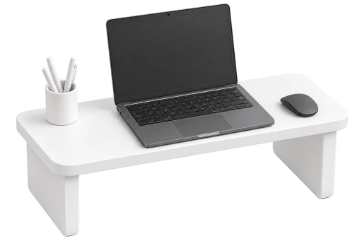
Once it unlocks at 30 referrals, every 10 more adds another $200 and unlocks your next Setup Upgrade request. There’s no limit.